Saturday, March 12, 2016

PAIRED TRACES
Ohio University kicked off thesis season with a bang with Daisie Hoitsma’s show at Trisolini Gallery in the Baker Center. Hoitsma’s abstract paintings on unprimed board feature repetitive structures with additions and removals. These patterns with rhythmic motions presenting a mostly monochromatic color palette feel a part of everyday movements and actions.
Knowing that Hoitsma is a new first time mother constructs specific meaning in the paintings. As she discovers her child’s needs and wants, the shapes and outlines of her everyday movements with the child develop into organized patterns that are translated into the marks on her paintings.
All these motions are new for the first time as evidenced by the unprimed board which reveals her as a blank slate, a tabula rosa of motherhood.


Connaught Cullen

The show runs March 8-12
For gallery hours visit ou.edu


Monday, November 17, 2014

A Tale of Two Exhibits


A Tale of Two Exhibits
 Transfiguration at the Wexner and Now-ism from the Pizzuti Collection

 Two very different exhibits are currently running in Columbus. Transfiguration is at the Wexner Center and features Modern masters: Picasso, Giacometti, Dubuffet, De Kooning, Degas, and Susan Rothenberg. Now-ism at the Pizzuti Collection, presents 21st century of the new abstract.
Just walking in the door gives you different experiences. At the Wexner timed tickets are required, no photographing allowed, my purse was searched and my pen confiscated (they gave me a stubby pencil to write with). I guess the recent defacing of artwork (Jeff Koons) has made them nervous. I think destroying or demeaning artwork because you don’t like it or don’t agree with it is the height of arrogance. Just because you don’t like something doesn’t mean it has no value. Check your ego.

Meanwhile back at the exhibit, all these rules and regulations scream stuffiness and over-blown importance. The exhibit is very aware of the works place in art history. Being a grad student in the art department, I’m very familiar with the work and have seen images of most of the work repeatedly so it was a bit hard to get excited about them, not that I don’t think the work is important but as I said, I had seen them before. It became a game of “oh I know that one”. I did enjoy Picasso’s earlier figurative work as it’s not shown ad nauseum. I also appreciated the work by Dubuffet, I wasn’t familiar with those particular pieces, so kudos.

While Transfigurations was …..figurative, Now-ism was purely abstract. The difference I found most striking was COLOR. Now-ism had plenty of it and GLITTER and GEOMETRY and YUMMY PAINT. The colors used were bright and pretty (I’m sure the modernist would be appalled at the colors). Looking at Tim Bavington’s Midnight Blues, I thought, eye candy, which led me to candy, which is what a lot of the color reminded me of, it was visually stunning. Another favorite was Pia Fries, her(his?) painting contained thick juicy paint  that I wanted to lick off the surface, In contrast, parts of Patrick Wilson’s surfaces were so smooth, it was hard to believe it was actually paint. The last piece I saw was Mindy Shapero’s The Infinite Truths of Flatterland . Several circles of rainbow colors layered with ceramic (?) forms remind me of spiral lollipops. I kept returning to eye candy because of all the yummy paint and color and glitter, but the purely visual is a concept of modernism and no self- respecting contemporary artist would just give us that, so go to the Pizzuti website and check out the artist statements.  No one checked my purse on entering and they said,” sure you can take pictures”, so feast your eyes.       Connaught
Patrick Wilson
Tim Bavington
 Carrie Moyer
Pia Fries
 Mindy Shapero


Tuesday, September 2, 2014

Animal Magnetism

Emily Beveridge has curated an exhibition for Majestic Gallery in Nelsonville, Oh. that presents viewpoints on our relationship to animals. The show opened on Final Fridays On The Square on August 29 and runs through September 21. Hannah Cameron's Awkward Exit seems to me to be about how we love to have animal trophies, whether taxidermy or photograph, it's all about how we capture and rule animals. The piece is a sculpture of a fish eating another fish, that fish in turn is laid out on a bed of roses. The accompanying photographs puts a period on our consumption of the fish. Seana Higgins sculpture, Not My Circus, But These Monkeys Belong To Me, for me references how we use animals for our entertainment in circuses, fights, zoos, etc. whether they like it or not. Julie Dummermuth's painting, Angels In The Rain, depicts a carousel, with the poor llama(?) being impaled by a candy cane. We like to sugar coat our animal abuse. Deneatte Pratt's painting is more upfront, the blood is a more honest assessment of our relationship with animals. Emily's stuffed wolf that hangs in the central hallway is warning of what might happen if the animals decide to turn on us. He has no legs but is a good twelve feet long and has kept his teeth. He's a mutant who hangs over us ready to attack.
Check Majestic website for gallery hours
majesticgalleries.com
Connaught

Wednesday, August 27, 2014

Koons Retrospective.


JEFF KOONS "A RETROSPECTIVE" REVIEW BY RYAN DAVIS


Jeff Koon’s is the one of the wealthiest, most popular and polarizing contemporary artists, all things that come with the territory as you rise up the ranks of the art world. We can cut the proper verbiage and tell the truth, or we either think Koon’s is a genius or a load of bullshit. He has drawn a lot of controversy over his career. Koons is not involved in the production of his work, which actually isn’t as rare as it seems among celebrity artists. Many critics question whether some of his work is engaging or simply pornography. I’ll be the first to admit that I have my biases against artists who are not involved with the production of there work. That easily puts me on one side of the fence of Koon’s work and that’s not even discussing how I feel about the visuals or content of his work. I mention this so that you understand that as much as I want to be unbiased in my review, this is my review so I don’t care how biased it comes off. The fact of the matter is these biases are important because work that is engaging enough can have the power to change or at least adjust those biases.

The Whitney Museum exhibits A Retrospect by Jeff Koon’s which is a large scale exhibition covering four floors of a large portion of his work dating as far back into the earliest parts of his artistry from 1978 to the present. All of his most well known pieces were at the exhibit: Equilibrium, Made In Heaven, and Celebration. The quantity of the work is enough to make a second visit to soak it all in.

While Jeff Koon’s work ranges visually from animal balloon sculptures in Celebration to nude photography he has been consistent in his focus. He explores themes of death and it’s inevitability and questioning the cultural context of sexuality. A large portion of his works consists of the use of readymades. Back in the 80s he created a series titled The New making readymade vacuums. These nostalgic vacuums existed as new and yet inevitable obsoleteness. These readymades are not altered or used but displayed in pristine cases elevated in a way that you would a painting. In fact Koon’s created these to exist in the same light of a painting. In his recent works we see returns to the use of readymades were he employs much more visuals to blur the lines of the copy
and the real thing.

Koons’s work and popularity has spanned three decades. The audiences that are drawn out to these grandiose exhibitions are your typical hipsters and old people, which is exactly what I saw. And because criticism is for all intents and purposes dead, you need no more validation of your status then drawing out hipsters and old people especially if those old people are economically wealthy. I can be more specific by stating rich old white people but this is not a commentary on exhibitions and the races of people that come to these shows. The hipster will make a commentary based on a Wikipedia entry they just read the day before seeing the exhibition. The old people are the purchases that validate why it deserves millions of dollars. Most of them have no idea what his work is about until they listen to their portable tour guide device. This is where find myself conflicted. To me he is not controversial because he made works that border the lines of controversial subjects. Art has been there done that. They’re not even explicit beyond simply seeing Koons’s genitalia. They only seem controversial in retrospect which is the context in which these older people understand it when they hear about his work through their tour guide devices. And his minimalism caters right to the mainstream hipsters who’s context of culture is based in large on minimalism – i.e. Apple products, all of fashion etc... I am not criticizing Koons for making work that caters to specific audience. What I am saying is it doesn’t raise new questions that the culture has already accepted. One might say that if that were the case he wouldn’t draw as much controversy as he does if the mainstream culture had already accepted the questions he raises. A valid point but non-artists critiques and art critiques within the field can be two different things. I doubt art critiques are as polarized as non-art critiques. Of course I am proof trying to create a polarizing view within the art community.

I’ve barely even touched on the fact that he doesn’t produce his own work, which I have a huge gripe with. I imagine Koons would argue that the art is strictly in the idea. If that is the case what is the point of the manifestation of the idea. The making of the product and the product itself are interrelated whether the process adds content to the piece or not. The arrogance in his statements is even more beyond me. A lot of the statements about him talk about his precision for details and having a keen eye. These things may be true about him but if we’re speaking in context of the production of the work then that credit goes to the actually producer. Koons set a high standard but it is the producer who has to have the keen eye to meet those standards because otherwise the product will not be made. It’s not like Koon’s will do it. Credit is due where credit is due and if Koon’s deserves credit for coming up with an idea without partaking in its creation then simple logic suggest that the producer(s) deserve credit for there contribution.

Sunday, June 29, 2014


E. A. Brown

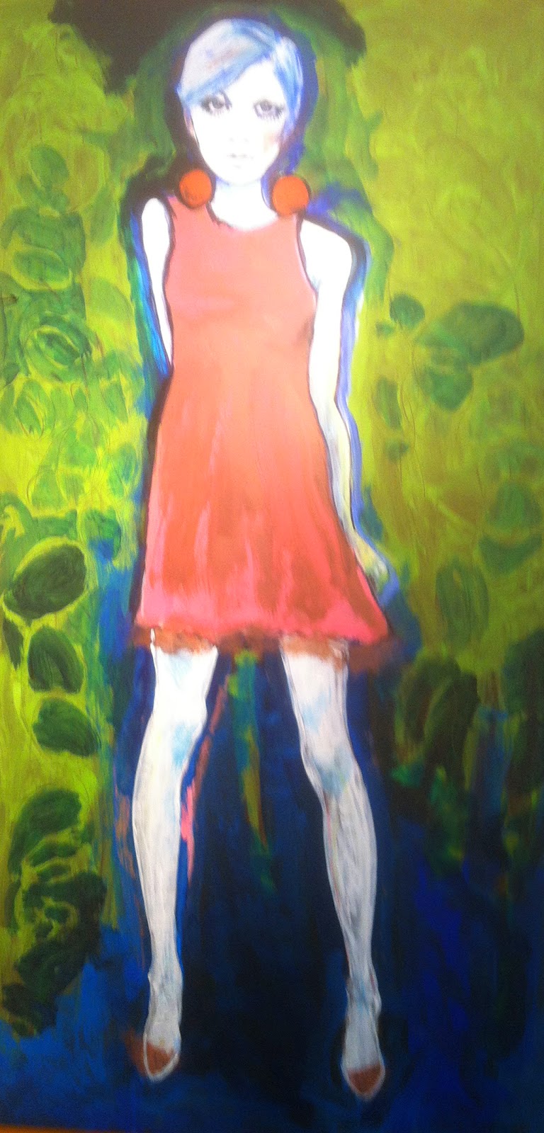
Fashion history is the subject matter for E. A. Brown’s mixed media paintings on display at Starbrick Gallery in Nelsonville, Ohio. Mostly from researched library photographs of local women, the paintings are of fashions from the Napoleonic era to the early 1900’s up to the 1960’x. The paintings are created with conte crayons, micron pens, acrylics, colored pencil and spray paint.

A feeling of ghostliness is derived from the whiteness of the paintings of earlier eras, depicting the shadow existence women had due to their limited choices. The brightly colored painting of Twiggy from the 60’s establishes the emancipation of women. Coming alive and expanding of women’s choices is reflected in the expansion of the color choices.

The exhibit runs through July 23. Check out their website for gallery hours. http://www.starbrick.com/
Connaught


Tuesday, April 15, 2014

C. David Russel "In-Between"


According to Wikipedia a liminal being is an ambiguous being which embodies the co-presence of opposites and challenges social classification.

Located in the front gallery of Majestic Galleries in Nelsonville, Ohio, C. David Russell’s exhibit “The In-Between” is a collection of liminals that reside in-between various states of breath and space. They live in-between painting and drawing, color and b/w, flora and fauna, organic and engineered, and between the monumental and the ethereal.

The piece with strong primary colors tilts the work toward painting, thus rendering no longer in-between. Three pieces on stained paper are also a little problematic to me. The stains of questionable origin obscure the subtle drawings. Hints of color within the images work best for me, they walk that line between drawing/painting quite nicely. Line and color highlight each other rather than overwhelm. They invoke a peaceful, romantic reverie.

The show runs through April 20, 2014. Visit www.majesticgalleries.com for gallery hours.

Connaught

Wednesday, November 20, 2013

Behavioral Patterns


Clayspace has a body of Jim Bowling's ceramic figures up in their attached space, Gallery 831. Behavioral Patterns depicts couples and individual figures in different modes and moments of relating to each other, from initial attraction to consummation. That isn't really the complete range, as any stage of a relationship can be purely physical or part of a deeper connection. Bowling captures these distinctions without being obscene. While there is a phallus for every figure, it is so commonplace in the show that it cannot be the only focal point. The emotions are human, not just male.

Bowling clearly enjoys his materials as well as his subjects. The bending of geometric forms makes them into figures. The form sets a tone that is further embellished through low fire glazes and bands of metal that add color and texture. The layers build up to imply depth of the characters and their experiences. Some parts are worn while others are polished to a high sheen. All of the forms and finishes give the feeling of a search for completeness through connection to others, whatever form that may take.

In Charged the two figures are so endowed they are literally tripods, but they stare intently straight into each other's faces. These are beings that have a sexuality but are too concerned with getting to know each other to allow those feelings to dominate other emotions, no matter how strong those feelings may later become. The two figures recognize a fit rather than a clone. Their surfaces are complementary rather than identical. The colors of the glazes and banding of the metal luster expand a common theme.

This contrasts with Mutual Attraction, in which the two figures stare into each other's faces, but the figures end at the waist and each face sprouts directly from a phallus. The expressions and dimensions of the figures let us know that although they might be looking at faces, their thoughts are elsewhere. This different type of attraction is presented as something that happens, not as a form of judgement.

Other pieces depict couples unified physically. In Ride a reclining figure extends through a hole in the center of a standing figure. The point of connection is not anatomically exact to the act, but their feeling of togetherness is unmistakable. Bowling does a nice job of setting up the situation and then letting us know what the focus really is, what details he finds most important.

An Uneasy Alliance features a reclining nude figure. The pose is reminiscent of the countless reclining nude females paintings and sculptures, but it is different because it is a man in this familiar position. The red color of the surface is broken by several bands of black and gold. One band wraps around the head over where the mouth would be, as if the mouth has been taped shut. With his silence ensured, the figure makes his best effort to appear relaxed, but tension remains in his reclined pose. Bowling leaves the other member of this alliance ambiguous.

After seeing all of the pieces, I was left with the feeling that connection is something all people need. Not everyone will connect the same way. Not everyone will be successful, but it is still universal. Can a nude just be a nude? Can a viewer evaluate the concept of nude art through the pose and context without focusing solely on the sexual dimensions? What if there are a lot of nudes and they are mostly of couples interacting? What if all of the many nudes are male? Should I have said “penis?” I feel more like I'm talking about art if I say “phallus,” but that may be a personal problem.

Visit the Clayspace website www.clayspace831.com for more information on the show or their ceramics classes and www.jimbowling.net for more information on the artist and photos of his work.