Saturday, March 12, 2016

PAIRED TRACES
Ohio University kicked off thesis season with a bang with Daisie Hoitsma’s show at Trisolini Gallery in the Baker Center. Hoitsma’s abstract paintings on unprimed board feature repetitive structures with additions and removals. These patterns with rhythmic motions presenting a mostly monochromatic color palette feel a part of everyday movements and actions.
Knowing that Hoitsma is a new first time mother constructs specific meaning in the paintings. As she discovers her child’s needs and wants, the shapes and outlines of her everyday movements with the child develop into organized patterns that are translated into the marks on her paintings.
All these motions are new for the first time as evidenced by the unprimed board which reveals her as a blank slate, a tabula rosa of motherhood.


Connaught Cullen

The show runs March 8-12
For gallery hours visit ou.edu


Monday, November 17, 2014

A Tale of Two Exhibits


A Tale of Two Exhibits
 Transfiguration at the Wexner and Now-ism from the Pizzuti Collection

 Two very different exhibits are currently running in Columbus. Transfiguration is at the Wexner Center and features Modern masters: Picasso, Giacometti, Dubuffet, De Kooning, Degas, and Susan Rothenberg. Now-ism at the Pizzuti Collection, presents 21st century of the new abstract.
Just walking in the door gives you different experiences. At the Wexner timed tickets are required, no photographing allowed, my purse was searched and my pen confiscated (they gave me a stubby pencil to write with). I guess the recent defacing of artwork (Jeff Koons) has made them nervous. I think destroying or demeaning artwork because you don’t like it or don’t agree with it is the height of arrogance. Just because you don’t like something doesn’t mean it has no value. Check your ego.

Meanwhile back at the exhibit, all these rules and regulations scream stuffiness and over-blown importance. The exhibit is very aware of the works place in art history. Being a grad student in the art department, I’m very familiar with the work and have seen images of most of the work repeatedly so it was a bit hard to get excited about them, not that I don’t think the work is important but as I said, I had seen them before. It became a game of “oh I know that one”. I did enjoy Picasso’s earlier figurative work as it’s not shown ad nauseum. I also appreciated the work by Dubuffet, I wasn’t familiar with those particular pieces, so kudos.

While Transfigurations was …..figurative, Now-ism was purely abstract. The difference I found most striking was COLOR. Now-ism had plenty of it and GLITTER and GEOMETRY and YUMMY PAINT. The colors used were bright and pretty (I’m sure the modernist would be appalled at the colors). Looking at Tim Bavington’s Midnight Blues, I thought, eye candy, which led me to candy, which is what a lot of the color reminded me of, it was visually stunning. Another favorite was Pia Fries, her(his?) painting contained thick juicy paint  that I wanted to lick off the surface, In contrast, parts of Patrick Wilson’s surfaces were so smooth, it was hard to believe it was actually paint. The last piece I saw was Mindy Shapero’s The Infinite Truths of Flatterland . Several circles of rainbow colors layered with ceramic (?) forms remind me of spiral lollipops. I kept returning to eye candy because of all the yummy paint and color and glitter, but the purely visual is a concept of modernism and no self- respecting contemporary artist would just give us that, so go to the Pizzuti website and check out the artist statements.  No one checked my purse on entering and they said,” sure you can take pictures”, so feast your eyes.       Connaught
Patrick Wilson
Tim Bavington
 Carrie Moyer
Pia Fries
 Mindy Shapero


Tuesday, September 2, 2014

Animal Magnetism

Emily Beveridge has curated an exhibition for Majestic Gallery in Nelsonville, Oh. that presents viewpoints on our relationship to animals. The show opened on Final Fridays On The Square on August 29 and runs through September 21. Hannah Cameron's Awkward Exit seems to me to be about how we love to have animal trophies, whether taxidermy or photograph, it's all about how we capture and rule animals. The piece is a sculpture of a fish eating another fish, that fish in turn is laid out on a bed of roses. The accompanying photographs puts a period on our consumption of the fish. Seana Higgins sculpture, Not My Circus, But These Monkeys Belong To Me, for me references how we use animals for our entertainment in circuses, fights, zoos, etc. whether they like it or not. Julie Dummermuth's painting, Angels In The Rain, depicts a carousel, with the poor llama(?) being impaled by a candy cane. We like to sugar coat our animal abuse. Deneatte Pratt's painting is more upfront, the blood is a more honest assessment of our relationship with animals. Emily's stuffed wolf that hangs in the central hallway is warning of what might happen if the animals decide to turn on us. He has no legs but is a good twelve feet long and has kept his teeth. He's a mutant who hangs over us ready to attack.
Check Majestic website for gallery hours
majesticgalleries.com
Connaught

Wednesday, August 27, 2014

Koons Retrospective.


JEFF KOONS "A RETROSPECTIVE" REVIEW BY RYAN DAVIS


Jeff Koon’s is the one of the wealthiest, most popular and polarizing contemporary artists, all things that come with the territory as you rise up the ranks of the art world. We can cut the proper verbiage and tell the truth, or we either think Koon’s is a genius or a load of bullshit. He has drawn a lot of controversy over his career. Koons is not involved in the production of his work, which actually isn’t as rare as it seems among celebrity artists. Many critics question whether some of his work is engaging or simply pornography. I’ll be the first to admit that I have my biases against artists who are not involved with the production of there work. That easily puts me on one side of the fence of Koon’s work and that’s not even discussing how I feel about the visuals or content of his work. I mention this so that you understand that as much as I want to be unbiased in my review, this is my review so I don’t care how biased it comes off. The fact of the matter is these biases are important because work that is engaging enough can have the power to change or at least adjust those biases.

The Whitney Museum exhibits A Retrospect by Jeff Koon’s which is a large scale exhibition covering four floors of a large portion of his work dating as far back into the earliest parts of his artistry from 1978 to the present. All of his most well known pieces were at the exhibit: Equilibrium, Made In Heaven, and Celebration. The quantity of the work is enough to make a second visit to soak it all in.

While Jeff Koon’s work ranges visually from animal balloon sculptures in Celebration to nude photography he has been consistent in his focus. He explores themes of death and it’s inevitability and questioning the cultural context of sexuality. A large portion of his works consists of the use of readymades. Back in the 80s he created a series titled The New making readymade vacuums. These nostalgic vacuums existed as new and yet inevitable obsoleteness. These readymades are not altered or used but displayed in pristine cases elevated in a way that you would a painting. In fact Koon’s created these to exist in the same light of a painting. In his recent works we see returns to the use of readymades were he employs much more visuals to blur the lines of the copy
and the real thing.

Koons’s work and popularity has spanned three decades. The audiences that are drawn out to these grandiose exhibitions are your typical hipsters and old people, which is exactly what I saw. And because criticism is for all intents and purposes dead, you need no more validation of your status then drawing out hipsters and old people especially if those old people are economically wealthy. I can be more specific by stating rich old white people but this is not a commentary on exhibitions and the races of people that come to these shows. The hipster will make a commentary based on a Wikipedia entry they just read the day before seeing the exhibition. The old people are the purchases that validate why it deserves millions of dollars. Most of them have no idea what his work is about until they listen to their portable tour guide device. This is where find myself conflicted. To me he is not controversial because he made works that border the lines of controversial subjects. Art has been there done that. They’re not even explicit beyond simply seeing Koons’s genitalia. They only seem controversial in retrospect which is the context in which these older people understand it when they hear about his work through their tour guide devices. And his minimalism caters right to the mainstream hipsters who’s context of culture is based in large on minimalism – i.e. Apple products, all of fashion etc... I am not criticizing Koons for making work that caters to specific audience. What I am saying is it doesn’t raise new questions that the culture has already accepted. One might say that if that were the case he wouldn’t draw as much controversy as he does if the mainstream culture had already accepted the questions he raises. A valid point but non-artists critiques and art critiques within the field can be two different things. I doubt art critiques are as polarized as non-art critiques. Of course I am proof trying to create a polarizing view within the art community.

I’ve barely even touched on the fact that he doesn’t produce his own work, which I have a huge gripe with. I imagine Koons would argue that the art is strictly in the idea. If that is the case what is the point of the manifestation of the idea. The making of the product and the product itself are interrelated whether the process adds content to the piece or not. The arrogance in his statements is even more beyond me. A lot of the statements about him talk about his precision for details and having a keen eye. These things may be true about him but if we’re speaking in context of the production of the work then that credit goes to the actually producer. Koons set a high standard but it is the producer who has to have the keen eye to meet those standards because otherwise the product will not be made. It’s not like Koon’s will do it. Credit is due where credit is due and if Koon’s deserves credit for coming up with an idea without partaking in its creation then simple logic suggest that the producer(s) deserve credit for there contribution.

Sunday, June 29, 2014


E. A. Brown

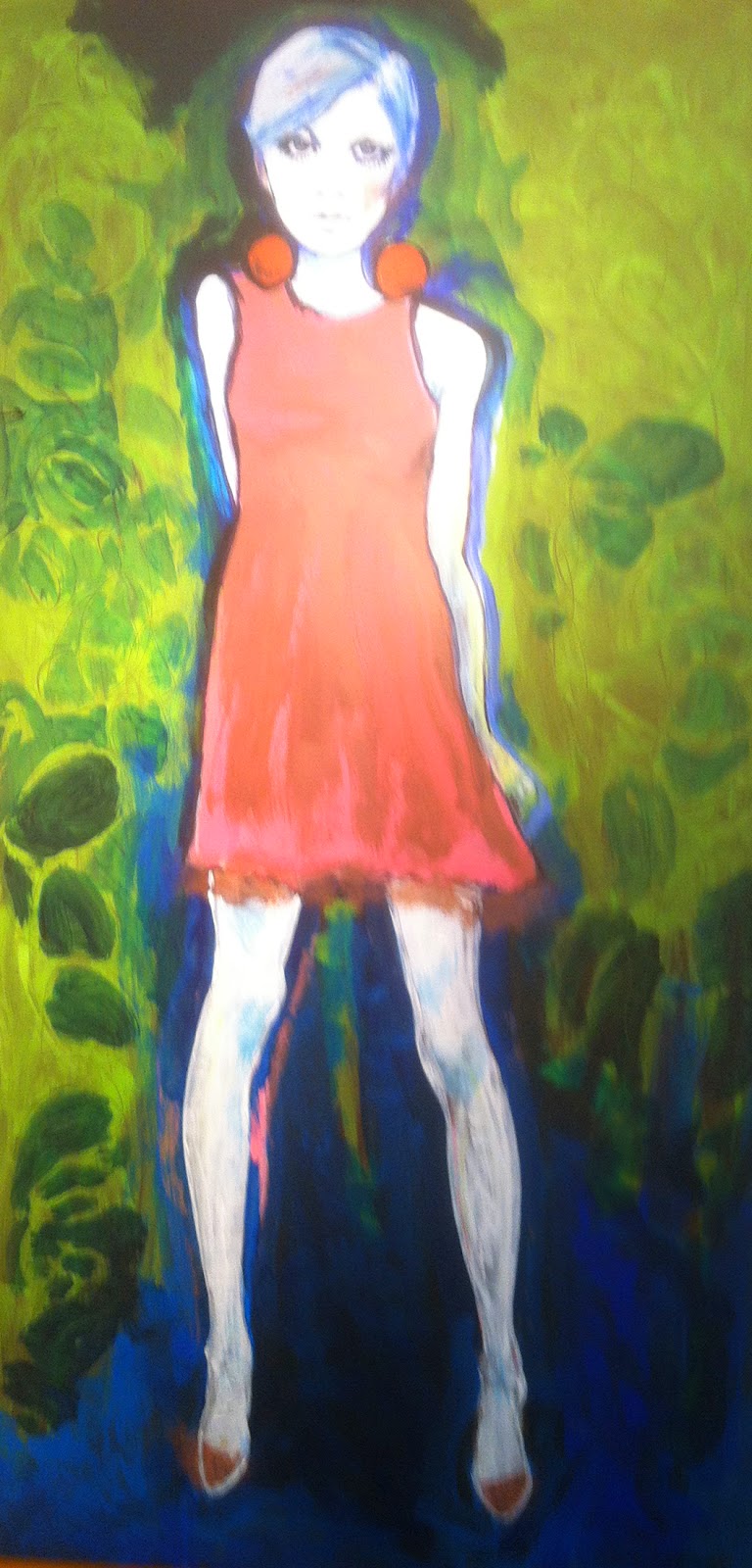
Fashion history is the subject matter for E. A. Brown’s mixed media paintings on display at Starbrick Gallery in Nelsonville, Ohio. Mostly from researched library photographs of local women, the paintings are of fashions from the Napoleonic era to the early 1900’s up to the 1960’x. The paintings are created with conte crayons, micron pens, acrylics, colored pencil and spray paint.

A feeling of ghostliness is derived from the whiteness of the paintings of earlier eras, depicting the shadow existence women had due to their limited choices. The brightly colored painting of Twiggy from the 60’s establishes the emancipation of women. Coming alive and expanding of women’s choices is reflected in the expansion of the color choices.

The exhibit runs through July 23. Check out their website for gallery hours. http://www.starbrick.com/
Connaught


Tuesday, April 15, 2014

C. David Russel "In-Between"


According to Wikipedia a liminal being is an ambiguous being which embodies the co-presence of opposites and challenges social classification.

Located in the front gallery of Majestic Galleries in Nelsonville, Ohio, C. David Russell’s exhibit “The In-Between” is a collection of liminals that reside in-between various states of breath and space. They live in-between painting and drawing, color and b/w, flora and fauna, organic and engineered, and between the monumental and the ethereal.

The piece with strong primary colors tilts the work toward painting, thus rendering no longer in-between. Three pieces on stained paper are also a little problematic to me. The stains of questionable origin obscure the subtle drawings. Hints of color within the images work best for me, they walk that line between drawing/painting quite nicely. Line and color highlight each other rather than overwhelm. They invoke a peaceful, romantic reverie.

The show runs through April 20, 2014. Visit www.majesticgalleries.com for gallery hours.

Connaught

Wednesday, November 20, 2013

Behavioral Patterns


Clayspace has a body of Jim Bowling's ceramic figures up in their attached space, Gallery 831. Behavioral Patterns depicts couples and individual figures in different modes and moments of relating to each other, from initial attraction to consummation. That isn't really the complete range, as any stage of a relationship can be purely physical or part of a deeper connection. Bowling captures these distinctions without being obscene. While there is a phallus for every figure, it is so commonplace in the show that it cannot be the only focal point. The emotions are human, not just male.

Bowling clearly enjoys his materials as well as his subjects. The bending of geometric forms makes them into figures. The form sets a tone that is further embellished through low fire glazes and bands of metal that add color and texture. The layers build up to imply depth of the characters and their experiences. Some parts are worn while others are polished to a high sheen. All of the forms and finishes give the feeling of a search for completeness through connection to others, whatever form that may take.

In Charged the two figures are so endowed they are literally tripods, but they stare intently straight into each other's faces. These are beings that have a sexuality but are too concerned with getting to know each other to allow those feelings to dominate other emotions, no matter how strong those feelings may later become. The two figures recognize a fit rather than a clone. Their surfaces are complementary rather than identical. The colors of the glazes and banding of the metal luster expand a common theme.

This contrasts with Mutual Attraction, in which the two figures stare into each other's faces, but the figures end at the waist and each face sprouts directly from a phallus. The expressions and dimensions of the figures let us know that although they might be looking at faces, their thoughts are elsewhere. This different type of attraction is presented as something that happens, not as a form of judgement.

Other pieces depict couples unified physically. In Ride a reclining figure extends through a hole in the center of a standing figure. The point of connection is not anatomically exact to the act, but their feeling of togetherness is unmistakable. Bowling does a nice job of setting up the situation and then letting us know what the focus really is, what details he finds most important.

An Uneasy Alliance features a reclining nude figure. The pose is reminiscent of the countless reclining nude females paintings and sculptures, but it is different because it is a man in this familiar position. The red color of the surface is broken by several bands of black and gold. One band wraps around the head over where the mouth would be, as if the mouth has been taped shut. With his silence ensured, the figure makes his best effort to appear relaxed, but tension remains in his reclined pose. Bowling leaves the other member of this alliance ambiguous.

After seeing all of the pieces, I was left with the feeling that connection is something all people need. Not everyone will connect the same way. Not everyone will be successful, but it is still universal. Can a nude just be a nude? Can a viewer evaluate the concept of nude art through the pose and context without focusing solely on the sexual dimensions? What if there are a lot of nudes and they are mostly of couples interacting? What if all of the many nudes are male? Should I have said “penis?” I feel more like I'm talking about art if I say “phallus,” but that may be a personal problem.

Visit the Clayspace website www.clayspace831.com for more information on the show or their ceramics classes and www.jimbowling.net for more information on the artist and photos of his work.


National Cup Show


Starbrick National 2013 Cup Show

Through November 23 you can find the National Cup show at the Starbrick Gallery located in Nelsonville, Ohio.  If unable to come out to Nelsonville for the show all of the cups entered can be conveniently viewed on their webpage http://www.starbrick.com .  However, a trip to the Starbrick Gallery would defiantly surpass viewing online to get the full tactile experience of handling the cups along with each artist’s individual statements.

 I found the show to be interesting to the form of what a functional drinking cup can be.  There were many different variations within the formal aspects, conceptual ideas, and sculptural components behind each cup.  Being of affordable price also for a piece of unique art that’s functional as well had people claiming their own “one of its kind” before I even walked in the door opening night.  I found myself wanting to purchase one for myself but many had already been claimed, which left me wishing there had been more cups entered.  Knowing that it is Starbrick’s tradition to be specific to primarily the ceramic material for the cup show I couldn’t help but also wonder why not have a show with the theme of cups open to other materials?  Perhaps this is a biased view coming from someone who works within a range of mixed media, but within the Starbrick gallery itself there is already other work outside of this show in a whole range of materials.  Nevertheless I found the show to be quite charming and appreciated the individual characteristic style within each ceramic cup.  

Perhaps my favorites were ones by Mat Rude, James Tingey, and Lucien Koonce.  Their sense of handling the material to mimic a recreation of organic forms you’d find in nature appeals to me.  This referencing nature then becomes an idea or meditation of bringing it into your home or bringing it into your body as a way to become one with nature.  Some other artists like Emily Nickel and Noelle Horsfield reference nature but in more of a graphic style that suggests a drawing or printing processes that is very unique and interesting.  I had to laugh when I saw Dan Roe’s cup which was the resemblance of what you’d associate to be a “holy grail.”  You don’t get much more spiritual than that.  The idea of drinking out of a cup everyday to experience a kind of immortality and emphasizing it as such by its grandiose  gold color and goblet structure.  If not the literal “holy grail” cup then perhaps drinking from Tim Carlburg’s portrait of Andy Warhol on a ceramic tin cup is more your taste.  It’s kind of interesting how this idea of the “holy grail” could possibly be depicted in several different ways. 

With all of these and the other cups I haven’t mentioned I come to see the wonderment and value of investigating the everyday experience of the drinking cup.  The significance and importance of these cups in the personalization and/or reflection of what it’s associating to is what makes them interesting for me. 
  Laura Dabrota


Thursday, October 31, 2013

"You Call That Art"


Emily Beveridge Review: “You Call That Art?” at Cultural Arts Center, Columbus Ohio


You Call That Art? is a juried exhibit that is on display at Cultural Arts Center now through November 5th. My friend, Sara Berens was an artist featured in the show, and so I tagged along with her to the opening reception earlier this month. The premise of the show was to cast a wide net, (there was no application fee to submit work) and get a mix of artists that respond to the question asked in the title.


As with many group shows, the quality of the art varied widely. I find that often juried shows lack cohesion, and I am afraid that You Call That Art? falls into this category. Although Cultural Arts is a beautiful and historic space, with tall ceilings and great light, I found that the layout of the show was jammed. This only added to the hodge podge nature of the work on display. The space really could have used some floating walls, to allow the pieces some breathing room.

 
Selected works included a bull made of curly telephone cord, a house made of hair, and an encaustic painting. My two favorite pieces both featured women as warriors, and were displayed close together in the space. Diana / Sarah Palin by Sarah Hahn was a mixed media ceramics statue that portrayed Sarah Palin in the pose of Diana the Huntress. This piece made me laugh out loud, and was a formidable presence in the gallery. Behind Hahn's piece was a digital photograph by Amanda Kline titled “Portrait of Xugha”, which depicted a neon warrior woman surrounded by cardboard cutouts with tribal motifs

Saturday, October 19, 2013

Margaret Eriksen


Review: A consideration of “local”, and the work of Margaret Eriksen
                                                                                                                     -Misty Morrison


            Cat with Very Little Brain, Ceramic/Acrylic.

Before I painted her, she sat out in the backyard for some time. When I started on her head I discovered a (discarded) wasps nest in her 'brain cavity'! Its still there.
           
           
            I went into Ohio University Lancaster's Wilkes Gallery with a number of presupposed expectations about local artists running through my thoughts. It wasn't until the moment when I glanced around the gallery space, and stood in front of the first painting that I began to confront these thoughts, and then much more slowly, as is the way with these things, the acceptance that I was subject to them. Following which I began to question just what it is about the application of the word local to the practice of art that is so easily acceptable as a negative.


An old song says “Kids! Whats the matter with kids today?!! Why can't they be like WE were (perfect in every way)? -Oh, What's the matter with kids today?” There are many reasons that children have difficulties in school. It's not just lack of effort from them and their teachers!

Why can Johnnie (and Sue and Leroy) still not read? Acrylic on canvas


            Answers to this musing are too numerous to list in the course of a review, and I'd like to focus instead on why I decided for myself that this attitude in response to Margaret Eriksen's work would be misguided. We feel like we know where the local artist is coming from- after all, their inspirations are perhaps places or things we passsed by on our way to see their work. I've given a great deal of thought lately to the practice of considering the intended audience of a work. If the bar I aspire to in my own practice is to raise questions, where does this work fall into that?

            Eriksen's piece “Why can Johnnie (and Sue and Leroy) still not read?” is a very straight-forward acrylic painting on canvas, the surface of which is taken up with stylized portraits, painted words, and color shapes creating a patterned ground onto which words and portraits are placed. There is a great deal of ambiguity for me in the juxtaposition of smiling portraits, and the cliché words attempted to announce exactly why Johnnie, Sue, and other children might not be performing in school. If I hadn't known from the artist's bio, I would know now that Eriksen had taught. It is quite within my presuppositions to expect a retired art educator to address the problems with the education system in their studio practice. But this work goes a little further than that for me, in that what it proports to be doing- telling me what is the matter with kids today- it is in fact, not. Instead, it is raising questions for me. The information that it does give me, that kids in local school districts face problems that make learning challenging, does nothing to lessen the question of why. Because I think it's obvious to anyone reading the painted words “hedonism”, “television”, and “environmental pollution” that the attribution to any one thing, most likely as outdated in concept and understanding as is our education system, just isn't solving any problems. Which raises the question: what will?


Lunchin' at the Sistine, Mixed Media

            Eriksen uses “humorous” as a descriptor in her own statement about her work, and there is a great deal of humor in them, but also something of whimsy. “Lunchin' at the Sistine” is the most overtly both, delivering no direct social message, but allowing us to form many of our own assumptions as to potential themes. This painting, and the body of work as a whole, references traditional tropes of painting that make them easily accessible (and in some cases easily disregardable) to insert social commentary that doesn't answer and of the issues it raises, combined with something wimsical to make it palatable. The recipe, though no update to any of the means she's employing, I have to say is compelling none the less. The group of work as a whole begs the questions, what is sacrificed of expanded perspective in the choice to remain local? Can that be a choice made to engage a specific audience? What sort of expanded understanding can be gained without leaving “home”?   Misty Morrison

"Peeled Paintings"


Peeled Paintings, Robert Tavani
Grid Furnishings, 944 N High St, Columbus, Ohio
August 4 – October 31, 2013
In Columbus, Ohio the first Saturday of every month is Gallery Hop. Art spaces in the Short North stay open into the evening. Some spaces are galleries in the traditional sense while others have incorporated galleries into other businesses. One such establishment is Grid Furnishings. Contemporary art goes nicely with the highly designed furniture in the showroom.
Currently Robert Tavani’s paintings are hanging on the walls at Grid. When I first saw Tavani’s Peeled Paintings, I couldn’t figure out what why they seemed so different than other paintings with color fields. It finally hit me that although they are obviously layered, the surface is smooth, almost glassy. It didn’t seem like it should be possible, but Tavani was kind enough to explain his process in the statement with the show. He works with acrylic paint on a clear support, peeling and adding layers and then observing changes through the clear substrate from the back of the painting. When he is finished, the back becomes the front and he removes the entire painting from the clear support and mounts it on canvas. The effect is similar to collage, while the smoothness of the surface unifies the many shaped layers into one.
Tavani strives to transform base materials, showing something familiar in a different light. The trace of the artist’s hand is preserved through the brushstrokes and jagged edges of shapes. The work maintains a very physical presence despite the glossy smoothness of the surface. What has obviously been painted almost appears manufactured because of the pristine finish.
L.E.E.K. I (2012), like most paintings on display, has no clear subject. The colors and shapes are given spotlight. There appears to have been some writing, but enough has been removed that only a few stray words remain. Here the transformation is nearly limited to the materials. There is a lingering sense that something was previously here, but the viewer is left to determine what it might have been. The tracks have been scrubbed clean since we are only left with the smooth reverse side while the side the artist worked from is fixed to the canvas.
Bouquet (2013) is the most clearly representational of the works. Tavani has transformed the subject matter as well as the paint. The blooms, stems, and vase appear to be flattened onto the same surface as the collaged swaths of paint. Instead of the cubist notion of viewing all sides at once, here all sides have become one; the bouquet seems to have been launched onto a slide like subatomic particles in an experiment at CERN. The elements of the floral arrangement exist, but no longer in their natural state. The colored paper of the wrappings takes the foreground amidst a field of blossoms, reversing the usual hierarchy. A recognizable, usually peaceful element, element of still lives is infused with chaos.
While Tavani has not turned the world of painting on its head, he has managed to find a way to keep paintings on canvas fresh. They weren’t created on canvas, but exist that way now. Something new retrofitted onto something old creates a space just weird enough to linger.

                        Brett Barton

Barbara Vogel Luminosity


The Columbus Gallery Hop is scheduled once a month, but I still always manage to arrive late- often too late to take in any galleries! October 5th was one of those days for my wife and I. On our way to enjoy a delicious but overpriced treat of Jenny’s Ice Cream (a local favorite and regular tradition), we poked our noses against the window at the Sherrie Gallerie ( 694 N. High St. Columbus, Ohio). In the dim auxiliary light coming thru the window, I could just make out these ghostly apparitions staring back at me from countless black frames. I knew I had to return, if only to assuage my curiosity.
It took me another week, but I finally made it when they were open. The show, Barbara Vogel Luminosity, was worth the wait. Mrs. Vogel’s Bachelor of fine arts and Master of fine arts in photography both came from the Ohio State University. She resides in Grandview Heights, Ohio. Her show will be up until November 9th.
Upon closer inspection, and with much better lighting, I did not lose that ghostly apparition effect. Not in the least. As a matter of fact, I would say the effect was much stronger directly. Displayed were a series of portrait oriented pictures stacked within an inch of each other, extending the length of the wall on both sides. The effect was that of stacked tombstones. The heightened repetition of form made the collection seem quite limitless, but also had the effect of making each image less special. It felt like an archive or a catalog. The combination of some smiling faces, the mix of the views from front to ¾ view, and the use of first names seemed to want to make the subjects personal, but the effect of stacking really canceled that out.  
I found myself transported to the Pere Lachaise Cemetary in Paris. Off the beaten path were a series of crematorium tombs tucked into a hallway of sorts, most decorated with sepia tone photos looking out at the visitors from the other side. I poured over the photos and tried to imagine the lives attached to them. These photos had that same strange eternal feeling, and I was captivated.
These “photos” were bleached of all but the faintest color, and they had a strange but beautiful shifting feel to them that gave the illusion that they existed behind the frame in three dimensions. The final touch was that the photos were entombed in encaustic. The lack of color combined with the shifting lack of focus made them feel like old photos with a strong link to history.
Not only was there an element of time implied by the archive, and by the reference to historical photos, but they also just felt like they were not just one second trapped, but several minutes trapped in one picture.  These wonderful mysterious photos seemed to exist outside of time.
Mrs. Vogel’s statement may help clarify her intent:  The “clickless” work presented is created from a hand held wand scanner, a “decisive moment” when my photographer’s eye and brain signaled my hand to press the shutter and capture the person’s character. This allows a new perspective on portraiture and gives my work overtones of mystery and intimacy. All of my images are fused with encaustic, giving the portrait or landscape a more haunting and ephemeral quality.
Ok, so my read was a bit dramatic, but pretty spot on in many ways! On my way out I got to speak with Sherrie Fox, the Gallery owner. She informed me that it took quite a while to figure out how to pour the hot wax on to the photos without burning them! Sometimes process can be boring, but the combination of the physicality of the hand held wand scanner recording time, and the use of hot wax to seal the image in perpetuity was far from boring. Bravo!

                         Aaron Smith